代码要点
当你自定义弹窗的时候,需要根据需求选择继承CenterPopupView,BottomPopupView,AttachPopupView/HorizontalAttachPopupView,DrawerPopupView,PartShadowPopupView,FullScreenPopupView,PositionPopupView其中之一。
每种弹窗的功能和使用场景如下:
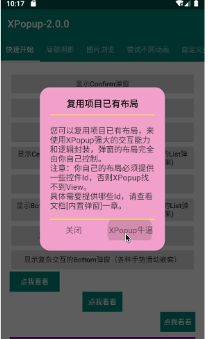
- CenterPopupView:中间弹窗的弹窗,比如:确认取消对话框,Loading弹窗等,如果不满意默认的动画效果,可以设置不同的动画器
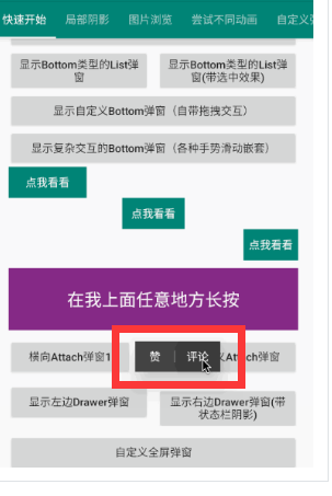
- BottomPopupView:从底部弹出的弹窗,比如:从底部弹出的分享弹窗,知乎的从底部弹出的评论弹窗,抖音从底部弹出的评论弹窗。这种弹窗 带有智能的嵌套滚动和手势拖动,默认不能设置其他的动画器;但调用enableDrag(false)时会禁用嵌套滚动和手势拖动,此时支持设置任意的动 画器
- AttachPopupView/HorizontalAttachPopupView:Attach弹窗是需要依附于某个点或者某个View来显示的弹窗,效果和系统的PopupMenu类似;其 中AttachPopupView会出现在目标的上方或者下方。如果希望想要微信朋友圈点赞弹窗那样的效果,出现在目标的左边或者右边,则需要继承 HorizontalAttachPopupView来做。 如果你想要带气泡的弹窗,XPopup还提供了带气泡的BubbleAttachPopupView和BubbleHoriztontalAttachPopupView使用。
- DrawerPopupView:从界面的左边或者右边弹出的像DrawerLayout那样的弹窗,Drawer弹窗本身是横向滑动的,但对ViewPager和HorizontalScrollView等横向滑动控件做了兼容,在弹窗内部可以放心使用它们
- PartShadowPopupView:局部阴影弹窗,因为它的阴影效果是局部的,并不全都是阴影。效果类似于淘宝商品列表下拉筛选弹窗,内部其实是Attach 弹窗的一种实现,因为仍然要依附于某个View出现
- FullScreenPopupView:全屏弹窗,看起来和Activity一样。该弹窗其实是继承Center弹窗进行的一种实现,可以设置任意的动画器
- ImageViewerPopupView:大图浏览弹窗,就像微信朋友圈点击缩略图看大图的效果一样;但是体验比微信的好多了。
- PositionPopupView,自由定位弹窗,如果你想让弹窗显示左上角,或者右上角,或者任意位置,并且不需要依附任何View,此时你需要它。
自定义弹窗只有2个步骤
一:根据自己的需求编写一个类继承对应的弹窗;
二:重写getImplLayoutId()返回弹窗的布局,在onCreate中像Activity那样编写你的逻辑即可。
注意:自定义弹窗本质是一个自定义View,但是只需重写一个参数的构造,其他的不要重写,所有的自定义弹窗都是这样。
------------------------------------------
自定义Center弹窗
class CustomPopup extends CenterPopupView {
//注意:自定义弹窗本质是一个自定义View,但是只需重写一个参数的构造,其他的不要重写,所有的自定义弹窗都是这样。
public CustomPopup(@NonNull Context context) {
super(context);
}
// 返回自定义弹窗的布局
@Override
protected int getImplLayoutId() {
return R.layout.custom_popup;
}
// 执行初始化操作,比如:findView,设置点击,或者任何你弹窗内的业务逻辑
@Override
protected void onCreate() {
super.onCreate();
findViewById(R.id.tv_close).setOnClickListener(new OnClickListener() {
@Override
public void onClick(View v) {
dismiss(); // 关闭弹窗
}
});
}
// 设置最大宽度,看需要而定,
@Override
protected int getMaxWidth() {
return super.getMaxWidth();
}
// 设置最大高度,看需要而定
@Override
protected int getMaxHeight() {
return super.getMaxHeight();
}
// 设置自定义动画器,看需要而定
@Override
protected PopupAnimator getPopupAnimator() {
return super.getPopupAnimator();
}
/**
* 弹窗的宽度,用来动态设定当前弹窗的宽度,受getMaxWidth()限制
*
* @return
*/
protected int getPopupWidth() {
return 0;
}
/**
* 弹窗的高度,用来动态设定当前弹窗的高度,受getMaxHeight()限制
*
* @return
*/
protected int getPopupHeight() {
return 0;
}
}
使用自定义弹窗:
new XPopup.Builder(getContext())
.asCustom(new CustomPopup(getContext()))
.show();
自定义Attach弹窗
public class CustomAttachPopup2 extends AttachPopupView / HorizontalAttachPopupView {
public CustomAttachPopup2(@NonNull Context context) {
super(context);
}
@Override
protected int getImplLayoutId() {
return R.layout.custom_attach_popup2;
}
}
带气泡的弹窗:
public class CustomAttachPopup extends BubbleAttachPopupView / BubbleHorizontalAttachPopupView {
public CustomAttachPopup2(@NonNull Context context) {
super(context);
}
@Override
protected int getImplLayoutId() {
return R.layout.custom_attach_popup2;
}
}
自定义DrawerLayout类型弹窗
对于DrawerLayout类型的弹窗,我只能帮你做好弹窗效果和手势交互。里面的UI和逻辑是无法帮你完成的,所以需要自定义一个弹窗,继承DrawerPopupView。代码非常简单,如下:
public class CustomDrawerPopupView extends DrawerPopupView {
public CustomDrawerPopupView(@NonNull Context context) {
super(context);
}
@Override
protected int getImplLayoutId() {
return R.layout.custom_drawer_popup;
}
@Override
protected void onCreate() {
super.onCreate();
findViewById(R.id.btn).setOnClickListener(new OnClickListener() {
@Override
public void onClick(View v) {
Toast.makeText(getContext(), "nothing!!!", Toast.LENGTH_SHORT).show();
}
});
}
}
使用自定义的DrawerLayout弹窗:
new XPopup.Builder(getContext())
.popupPosition(PopupPosition.Right)//右边
.hasStatusBarShadow(true) //启用状态栏阴影
.asCustom(new CustomDrawerPopupView(getContext()))
.show();
自定义局部阴影弹窗
这种效果的阴影是局部范围的,也要依附于某个View,在其上方或者下方显示。常见于列表条件筛选弹窗,比如京东或者淘宝的商品列表筛选。同样我只能帮你把复杂的交互效果做了,弹窗里面的UI和逻辑需要你自己继承PartShadowPopupView来做,这当然非常简单。 最简单的示例如下:
public class CustomPartShadowPopupView extends PartShadowPopupView {
public CustomPartShadowPopupView(@NonNull Context context) {
super(context);
}
@Override
protected int getImplLayoutId() {
return R.layout.custom_part_shadow_popup; // 编写你自己的布局
}
@Override
protected void onCreate() {
super.onCreate();
// 实现一些UI的初始和逻辑处理
}
}
显示的时候仍然需要指定atView显示,内部会智能判断应该如何展示以及使用最佳的动画器:
new XPopup.Builder(getContext())
.atView(ll_container)
.asCustom(new CustomPartShadowPopupView(getContext()))
.show();
自定义Bottom类型的弹窗
自定义Bottom类型的弹窗会比较常见,默认Bottom弹窗带有手势交互和嵌套滚动;如果您不想要手势交互可以调用enableDrag(false)方法关闭。 如果弹窗内有输入框,在弹出输入法的情况下,弹窗默认会贴附在输入法之上,并且保证不会盖住输入框;目前Center和Bottom类型弹窗有此效果。 请注意:弹窗的宽高是自适应的,大部分情况下都应该将弹窗布局的高设置为wrap_content;除非你希望得到一个高度撑满的弹窗。
Demo中有一个模仿知乎评论的实现,代码如下:
public class ZhihuCommentPopup extends BottomPopupView {
VerticalRecyclerView recyclerView;
public ZhihuCommentPopup(@NonNull Context context) {
super(context);
}
@Override
protected int getImplLayoutId() {
return R.layout.custom_bottom_popup;
}
@Override
protected void onCreate() {
super.onCreate();
recyclerView = findViewById(R.id.recyclerView);
ArrayList
for (int i = 0; i < 30; i++) {
strings.add("");
}
CommonAdapter
@Override
protected void bind(@NonNull ViewHolder holder, @NonNull String s, int position) {}
};
commonAdapter.setOnItemClickListener(new MultiItemTypeAdapter.SimpleOnItemClickListener(){
@Override
public void onItemClick(View view, RecyclerView.ViewHolder holder, int position) {
dismiss();
}
});
recyclerView.setAdapter(commonAdapter);
}
// 最大高度为Window的0.85
@Override
protected int getMaxHeight() {
return (int) (XPopupUtils.getWindowHeight(getContext())*.85f);
}
}
自定义全屏弹窗
public class CustomFullScreenPopup extends FullScreenPopupView {
public CustomFullScreenPopup(@NonNull Context context) {
super(context);
}
@Override
protected int getImplLayoutId() {
return R.layout.custom_fullscreen_popup;
}
@Override
protected void onCreate() {
super.onCreate();
//初始化
}
}
自定义ImageViewer弹窗
目前大图浏览弹窗支持在上面添加任意自定义布局和背景颜色,做法是写一个类继承ImageViewerPopupView弹窗,然后重写布局即可。 代码如下:
public class CustomImageViewerPopup extends ImageViewerPopupView {
public CustomImageViewerPopup(@NonNull Context context) {
super(context);
}
@Override
protected int getImplLayoutId() {
return R.layout.custom_image_viewer_popup;
}
}
由于是自定义的大图浏览弹窗,就要用自定义弹窗的方式来开启了:
//自定义的弹窗需要用asCustom来显示,之前的asImageViewer这些方法当然不能用了。
CustomImageViewerPopup viewerPopup = new CustomImageViewerPopup(getContext());
//自定义的ImageViewer弹窗需要自己手动设置相应的属性,必须设置的有srcView,url和imageLoader。
viewerPopup.setSingleSrcView(image2, url2);
viewerPopup.setXPopupImageLoader(new ImageLoader());
new XPopup.Builder(getContext())
.asCustom(viewerPopup)
.show();
自定义Position弹窗
public class QQMsgPopup extends PositionPopupView {
public QQMsgPopup(@NonNull Context context) {
super(context);
}
@Override
protected int getImplLayoutId() {
return R.layout.popup_qq_msg;
}
}
自由定位弹窗,默认是显示在屏幕的左上角,你可以通过offsetX()和offsetY()来控制显示位置,如果你希望水平居中,可以用isCenterHorizontal(true)选项来做到。
new XPopup.Builder(getContext())
.popupAnimation(PopupAnimation.ScaleAlphaFromCenter)
.isCenterHorizontal(true)
.offsetY(200)
.asCustom(new QQMsgPopup(getContext()))
.show();